
Table of Contents
- Unlock Premium With Pastel Colours
- Pastels & Their Pairs
- How To Choose Pastel Shades That Fit Your Style?
- Pastels Vs. Brights: Which Works Best In My Small Room?
- Why Is It Best To Avoid Bright Colours In Small Rooms?
- How To Set The Pastel Colours For Your Small Kitchen Room?
- End: Involve MAI in Balanced Pastel Colour Project Completion
Key Takeaway: Pastel colours are a never-ending love story in your property designs. Hope everyone feels comfortable with the pastel colours, and designing them with other home elements and features can be as easy as an apple pie. Their perpetual look and feel are so elegant for the home interiors, studios, baby rooms, KG school interiors, commercial rental spaces, and even office spaces. When blended strategically with the interiors, the colour pastels could appear brighter and more spacious, enhancing both the aesthetic and emotional appeal of a property. In this blog, we list out how to style the pastel colours for your rooms and spaces and, at the same time, find the best Traders and qualified painting services to work on your projects.
Unlock Premium With Pastel Colours
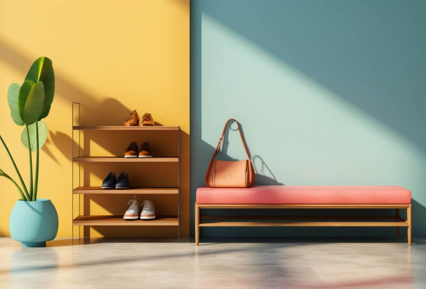
Pastel colours are too soft as the visuals and their amusing soothing tones enhance an inviting and cosy atmosphere in any space. Unlike bold or dark shades, pastels such as pale pinks, gentle blues, soft yellows, and mint greens reflect light, making rooms feel brighter and more open. The light-reflecting quality of these shades helps your small or dimly lit spaces to appear spacious and airy, enhancing the kind of warmth you expect. The subtle feature of the pastel colours also has a calming psychological effect. Soft houses are often tender, reduce stress, and promote relaxation, especially at night. The more the comfort, the more your no-stress sleep. Pastels shall evoke warmth without overpowering your room’s look. Striking the perfect balance between elegance and cosiness.
Pastels & Their Pairs
Pastel colours are too soft as the visuals and their amusing soothing tones enhance an inviting and cosy atmosphere in any space. Contrasting to these bold or dark shades, pastels such as pale pinks, gentle blues, soft yellows, and mint greens reflect light, making rooms feel brighter and more open. The light-reflecting quality of these shades helps your small or dimly lit spaces to appear spacious and airy, enhancing the kind of warmth you expect. The subtle feature of the pastel colours also has a calming psychological effect. Soft houses are often tender, reduce stress, and promote relaxation, especially at night. The more the comfort, the more your no-stress sleep. Pastels shall evoke warmth without overpowering your room’s look. Striking the perfect balance between elegance and cosiness. Hire a professional guide to help you from planning to execution or to find the painters near you. To do that, you must sign up as Project Owner at MAI.
How To Choose Pastel Shades That Fit Your Style?
Now, let us work on this thing to choose pastel shades that fit your style? Choosing the right pastel shades for your home shall be a simple and sophisticated view with a few key considerations.
Start by identifying the mood you want to create in each room; soft blues and greens evoke calmness, making them ideal for bedrooms or bathrooms, while warmer shades like peach or blush pink add a welcoming feel to living spaces.
Assess your existing decor; Pastels work well with neutral tones like whites, beiges, and greys. If your furniture or accessories are more vibrant, choose pastel shades that complement them rather than clash.
Do you wish for a subtle look? Then, select from a pastel palette that contrasts gently with your current colour scheme.
Consider the room’s lighting as well. Natural light enhances pastel tones, so brighter rooms should handle cooler shades like lilac or mint.
In dimmer spaces, opt for warmer pastels like soft peach or buttery yellow to maintain a cosy ambience. Test a few samples on the wall before committing.
This allows you to see how the pastels interact with your normal yet existing decor. Choose the shades that resonate with your personal style and home’s atmosphere, and you can create a cohesive and elegant look throughout your property.
To connect with plenty of traders, kindly call us or email us at info@myproject.ai.
Pastels Vs. Brights: Which Works Best In My Small Room?
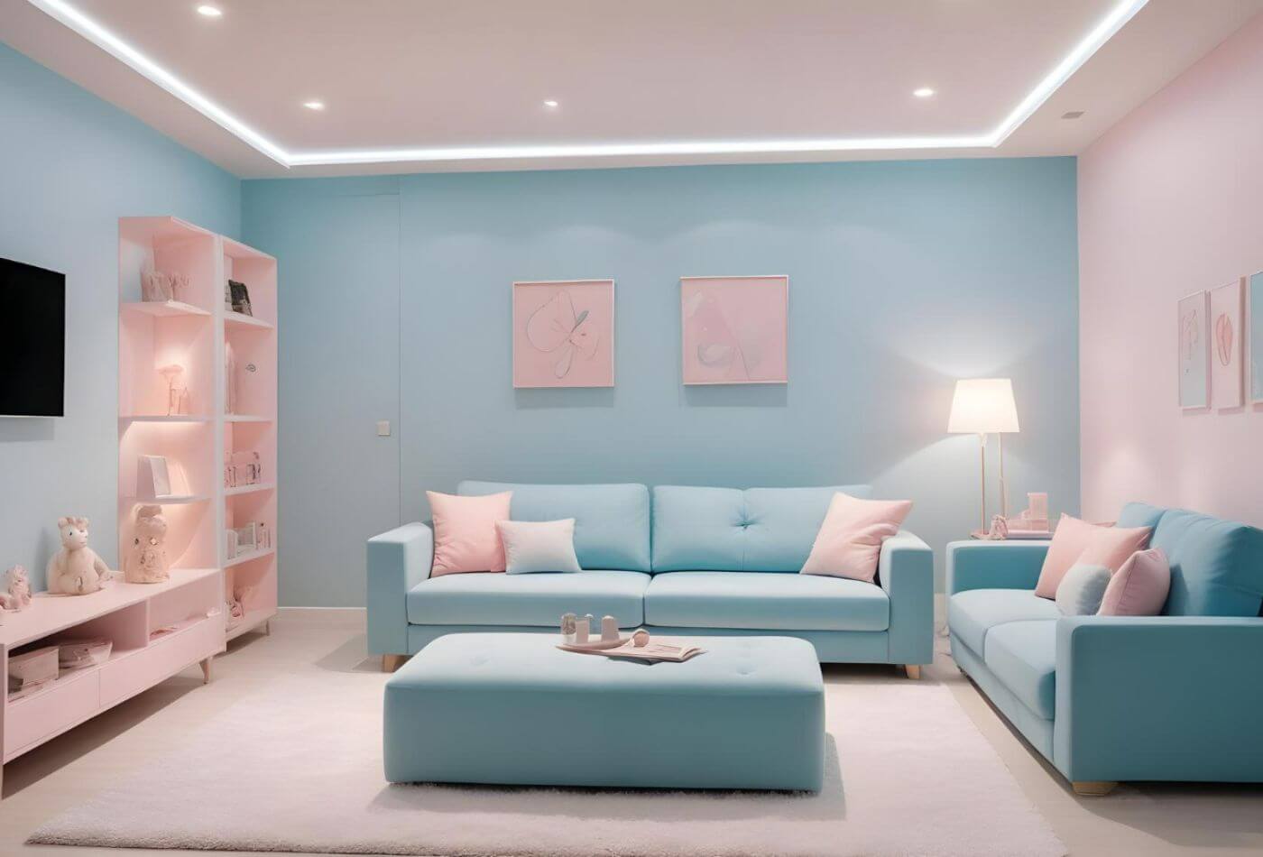
To say you have a small room with many shelves and grooves but want to style the super cute pastel colours is the ideal choice over bright hues. Pastels like soft blues, blush pinks, and mint greens reflect more light, making small spaces feel larger and more open. Light tones usually bring a sense of calm and balance to a room with multiple visual elements, like living rooms with shelves, grooves, and other architectural details. With this, you can soften the room's overall appearance, creating a serene atmosphere without overwhelming the eye.
Why Is It Best To Avoid Bright Colours In Small Rooms?
Bright colours, on the other hand, could make a small room feel cramped and busy, especially if the space already has a lot of built-in features. Bold hues have the potential to highlight the room’s complexity, drawing attention to every shelf and groove, which can create a cluttered look.
How To Set The Pastel Colours For Your Small Kitchen Room?
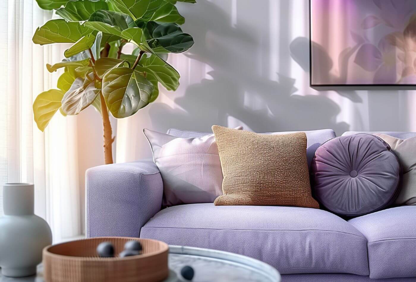
To enhance your small kitchen room, consider painting the walls with the pastel shades we have mentioned, allowing your shelves and grooves to blend seamlessly into the space. You can include accents of brighter colours through decor pieces like cushions, vases, or artwork to bring contrast without overpowering the room. This approach will mark a harmonious balance, making your small space feel cosy yet spacious.
End: Involve MAI in Balanced Pastel Colour Project Completion
Let us brush up quickly! Balancing pastel colours with bold accents is an easy way to create a stylish and cohesive space. Start by using pastel shades as the base for walls or larger furniture pieces. Soft colours like mint green, blush pink, or lavender provide a calming backdrop without overpowering the room. They create an open, airy feel, ideal for living areas or bedrooms. Introduce the bold accents and add striking elements like bright cushions, artwork, or rugs in contrasting colours. Shades like deep blue, vibrant yellow, or bold red work well to bring energy into the space. The key is moderation; use bold accents sparingly so they don’t overwhelm the pastel foundation.
Patterns are another effective way to blend pastels and bolds. Choose textiles or decor items that mix both light and vibrant tones, creating visual interest while maintaining balance. Metallic finishes or dark wood can also add depth, complementing both pastel and bold accents. Join MAI, which lends you supreme home services, and get guidance on completing your projects with the perfect balance! Click to read about MAI ❤️!